How Might We solve the communication problems of people suffering from Motor Neuron Disease and make their everyday tasks more accessible?
Sep 2018 - Nov 2018
Every year, 2 out of 100,000 people are diagnosed with ALS, a neurodegenerative disease that tragically leads to certain death within 3-5 years. Given the limited lifespan of ALS patients, they heavily depend on expensive equipment to maintain their communication abilities. As a Product/UX Designer, I extensively researched the communication devices available in the market and developed an operating system-agnostic user experience. This solution aims to minimize and alleviate the communication barriers between patients and the world around them, offering a more accessible and inclusive experience.
My Role
-
User Research
-
Competitive Analysis
-
Wireframing
-
Prototyping
-
UX Design
-
Interaction Design
-
Usability Testing
Platform(s)
-
Desktop
-
Mobile
-
Web (Responsive)
Tool(s)
-
Trello
-
Adobe XD
-
Axure
-
Adobe Photoshop
-
Adobe Illustrator
01. Learning from Competition and People
a. From Competition
A study conducted by the University of Los Angeles reveals that many of the current technologies have a low satisfaction level among patients. One significant contributing factor to this dissatisfaction is the time-consuming nature of forming sentences using these communication methods. Patients often face challenges and delays in expressing themselves effectively, which can hinder their overall communication experience.
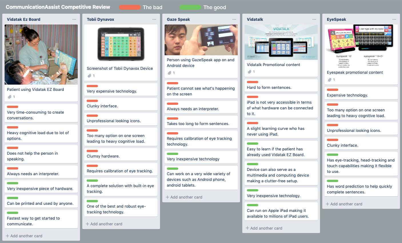
Competitive Analysis in Trello
b. From Caretakers of Patients
"We ended up using a letter board like you see in breaking bad. It was very tedious and terrible.”
- beardedjack (Reddit/r/ALS)
"My father had a trach put in right away so that was a problem. Then he used a stylus to point letter on a card. Towards the end, his hand had curled inwards so he had hard time holding the stylus. At the same time his hands were shaking a lot.”
- syzygymoon (Reddit/r/ALS)
"We used smart home integration as much as possible as well, but still found most integration with tobii very clunky. Instead of voice commands for lights we installed motion sensors with auto on/off. One less task he would have to do (or me if my hands were full)."
- caregivingisalot (Reddit/r/ALS)
02. Mapping Journey Through Research
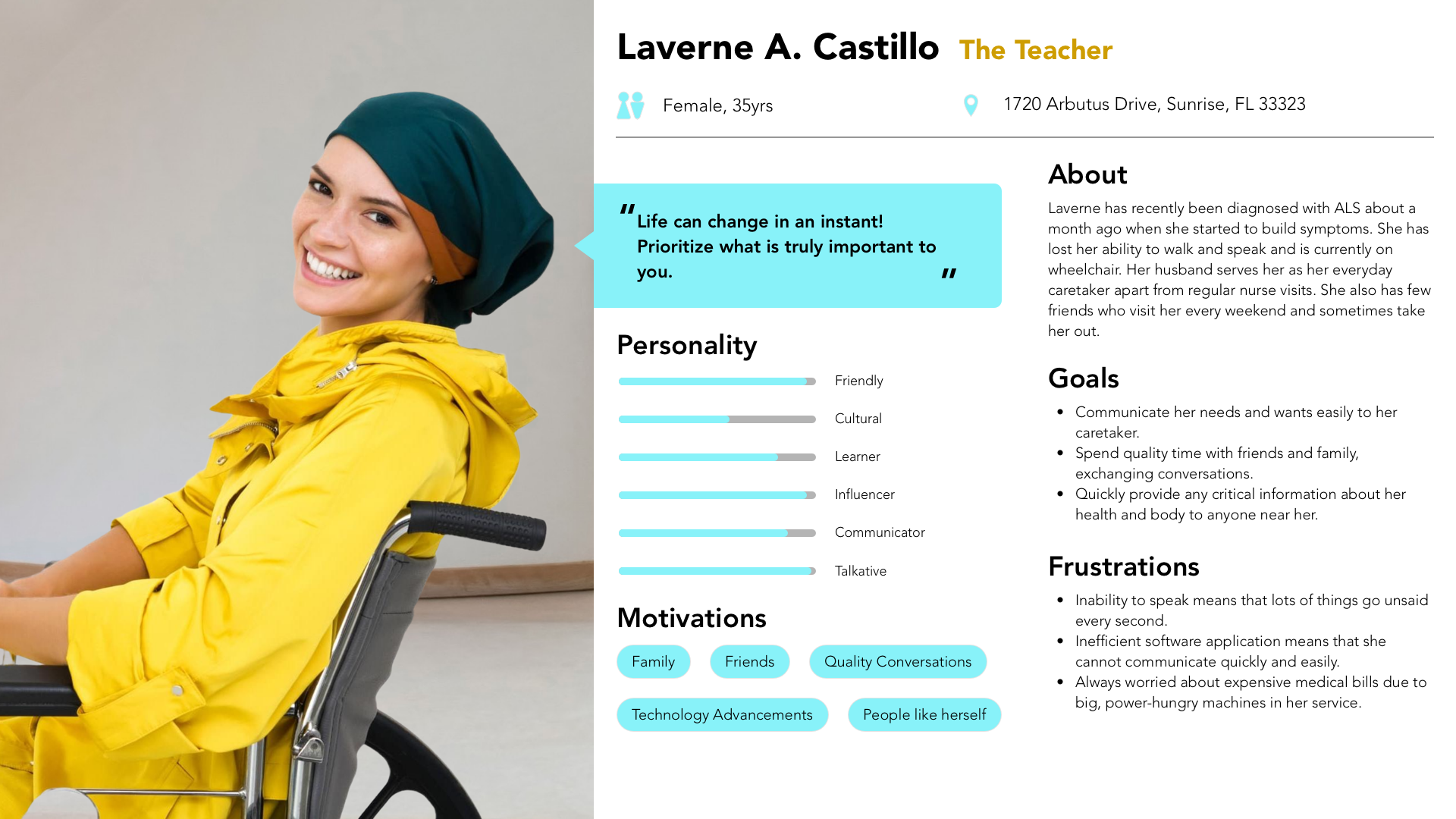
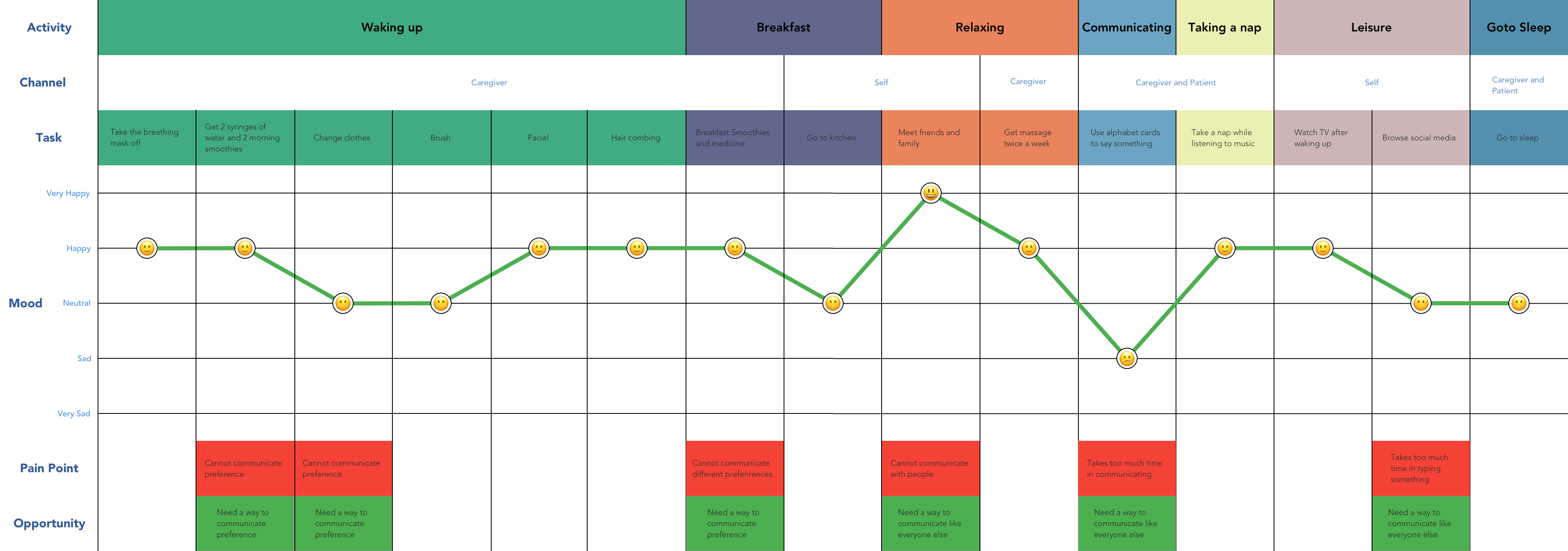
“Some of the most inspirational stories and information about the lives of people with neurodegenerative disease helped shape the persona and the journey map"
I scoured Reddit’s ALS subreddit and various blogs on the internet to gather insights into the daily lifestyle of individuals living with ALS. This extensive research provided valuable information on the challenges and issues faced by patients in their day-to-day lives. These insights were instrumental in developing accurate personas and crafting a comprehensive journey map for the project.
03. Conceptualizing a New Way of Communicating
The critical challenge that many other products fail to address is providing continuous support for users as the disease progresses. It is essential to accommodate their changing needs throughout the journey. To tackle this, I initially created a test sketch to outline the concept and later developed a refined Axure prototype. Given the extraordinary nature of the product, it required a unique usability testing scenario, which involved:
-
Two participants in each session: one user and one friend.
-
Only the user was permitted to interact with the prototype.
-
The user was not allowed to speak during the testing.
-
Usage was restricted to a trackpad, with no wrist movement and only one finger.
Drawing from the successful test results, I further refined the product, enhancing its visual identity and user experience for an improved overall design.
04. Designing for Extraordinary Humans
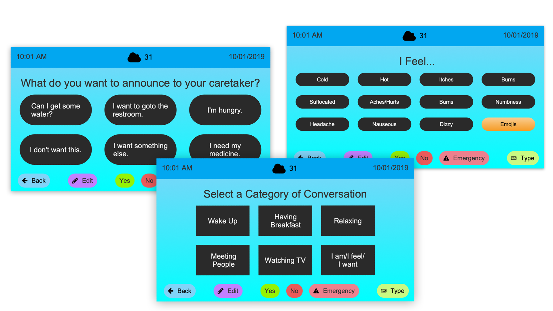
The initial concept revolved around designing an app to support ALS patients in their communication requirements. To establish its identity, I developed two components:
-
Screen Assist: A comprehensive system catering to regular computing needs.
-
Communication Assist: An app specifically designed to address communication needs, functioning within the Screen Assist framework.
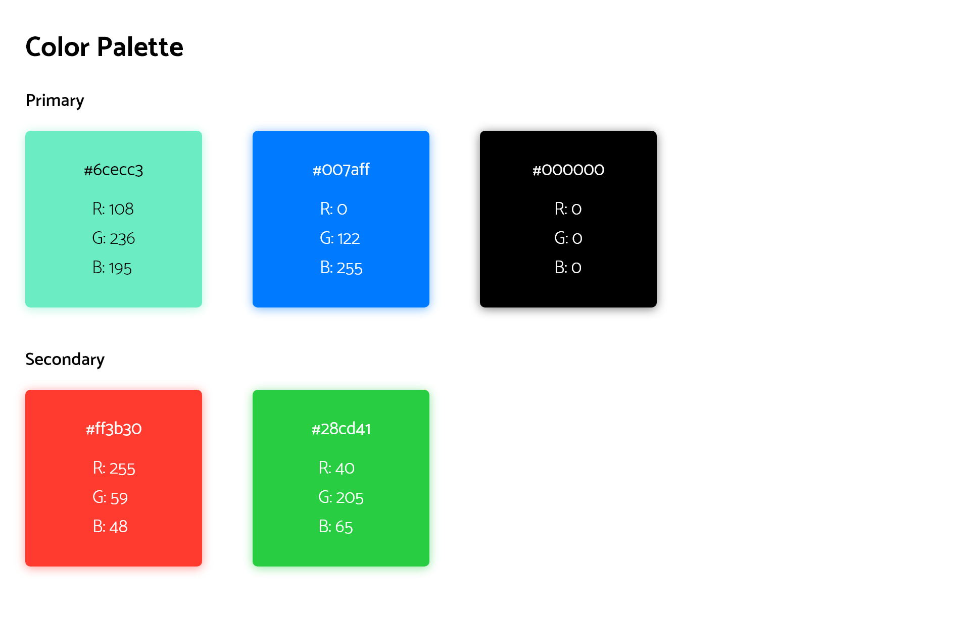
The goal was to create an application that would grant users effortless access to essential phrases, facilitate emergency communication, and enable typing complete sentences. Given the app’s primary focus on communication, the logo was crafted to visually convey this purpose.
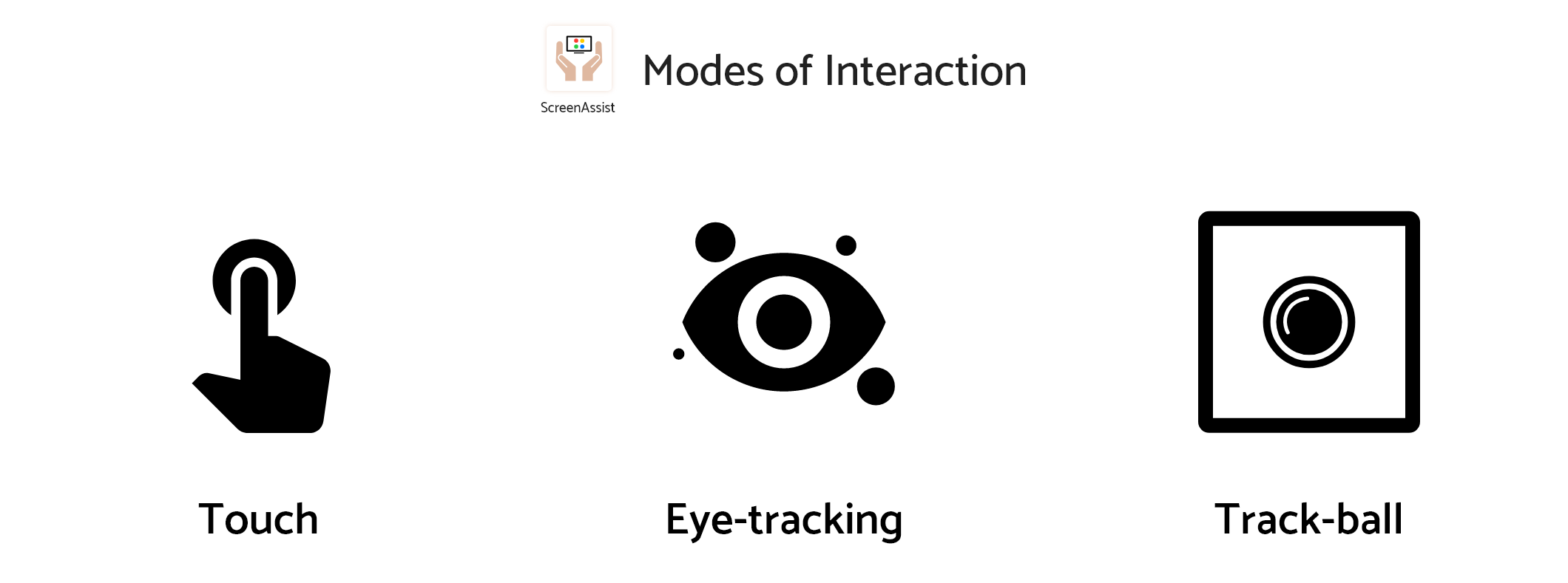
Envisioning Modes of Interaction
The Issue
"One of the reasons why many existing solutions fall short is their neglect of the caregiver as a user within the interaction environment."
The Goal
The goal was to ensure usability across multiple modes of interaction, which is why all interface elements are designed to be easily visible and accessible, even from a distance, with ample touch targets.
Designing The Accessible Experience
A Meaningful and Friendly Identity
The loading screen effectively represents the evolution and intelligence of assistive technology, demonstrating its purpose to provide assistance and support to users.
An Easier Way to Compose Messages
Composite Messages empower users to modify pre-defined sentences by replacing specific words, eliminating the need to repeat or retype entire sentences. This feature enables seamless context changes with minimal effort.
A Quick Way to Communicate Quick Stuff
By providing a quick selection of words and phrases, users can conveniently save their most frequently used expressions, accessible across various apps. This feature ensures easy access to commonly used phrases, irrespective of the application in use.
An Easier Way to Compose Messages
Visualizing the location and intensity of pain to caregivers becomes invaluable when verbal or physical communication is limited due to physical constraints. Using Communication Assist allows the user to quickly communicate pain visually.
Read Next:

ALSAC - St. Jude Children’s Research Hospital Product Design
How might we establish streamlined payments experience across fundraising apps and cultivate a strong design-awareness culture among teams?
Enter Password
Continental AG UX Design
How might we streamline and enhance the user experience of a highly technical audio tuning application, reducing clutter, improving efficiency, and ensuring ease of learning?
Enter Password