How Might We make the process of blood donation less intimidating and more rewarding so more people are inclined to donate?
2014 - Present
Millions of people make the noble decision to donate blood every day across the globe, while many others choose not to do so for a variety of reasons. Throughout my years as a UX researcher and designer, I have had the opportunity to delve into the complexities of the blood donation experience, uncovering both its rewarding aspects and potential challenges. In my role, I have also explored the concept of establishing a trustworthy non-profit organization dedicated to facilitating and promoting blood donation.
My Role
-
User Research
-
Literature Review
-
Wireframing
-
UI Design
-
Graphic Design
-
Icon Design
Platform(s)
-
Mobile
Tool(s)
-
Adobe Photoshop
-
Adobe Illustrator
-
Adobe Premiere Pro
-
Adobe XD
-
Figma
2014 - 2015: Where It All Started
“BeDonor” was the name I gave to a UI design that I created back in 2014. The objective was to centralize blood donation data and establish a seamless experience for donors, patients, hospitals, and blood banks. The primary aim was to democratize the process and ensure a consistent supply of blood wherever it was needed. In 2015, I expanded on the concept by incorporating additional features that allowed users to discover healthcare and emergency facilities, access information about the services they offer, and navigate to their locations.
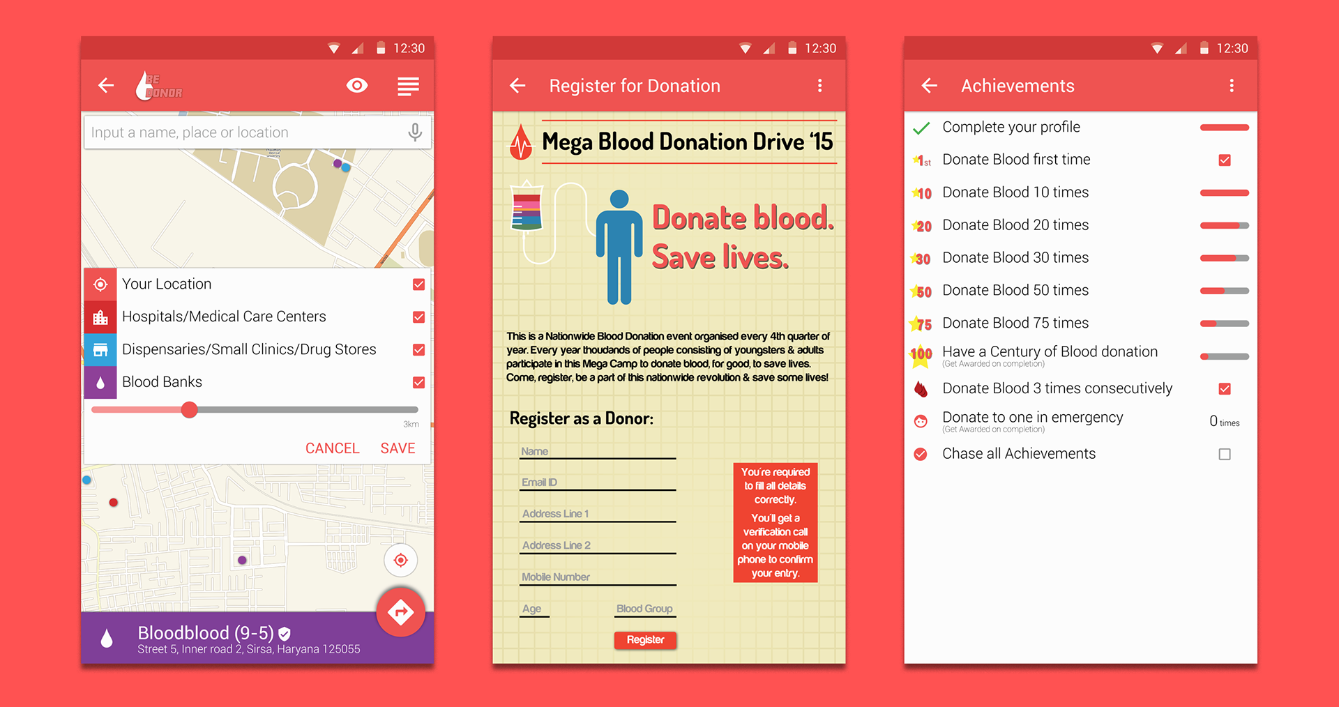
Features such as finding nearby medical facilities, registering to donate blood, and achievements
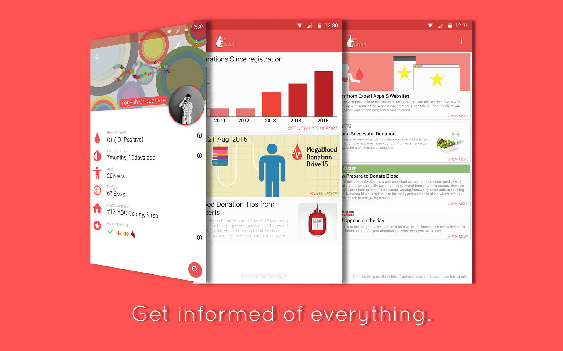
Features such as Donor Profile, Stats, and Knowledge
2017: Adding The Missing Pieces
In 2014, I embarked on an informal journey of learning UI design. While the concept of democratizing the blood donation process was compelling, I soon realized that a crucial element was missing: background research. It was during my Human-Computer Interaction program at DePaul University that I had the opportunity to delve into the world of research. For my “Foundations of Research” class, I chose to focus on the concept of blood donation and non-profit organizations. The title of my research was:
“Aesthetic and Social Factors for Designing Non-Profit Websites and Apps”
Through this research, I explored various factors that contribute to the trustworthiness of a non-profit organization and how such organizations can effectively engage users to maintain a sustainable pool of donations. This research provided valuable insights into the design considerations and strategies that can enhance the user experience and impact of non-profit websites and apps.
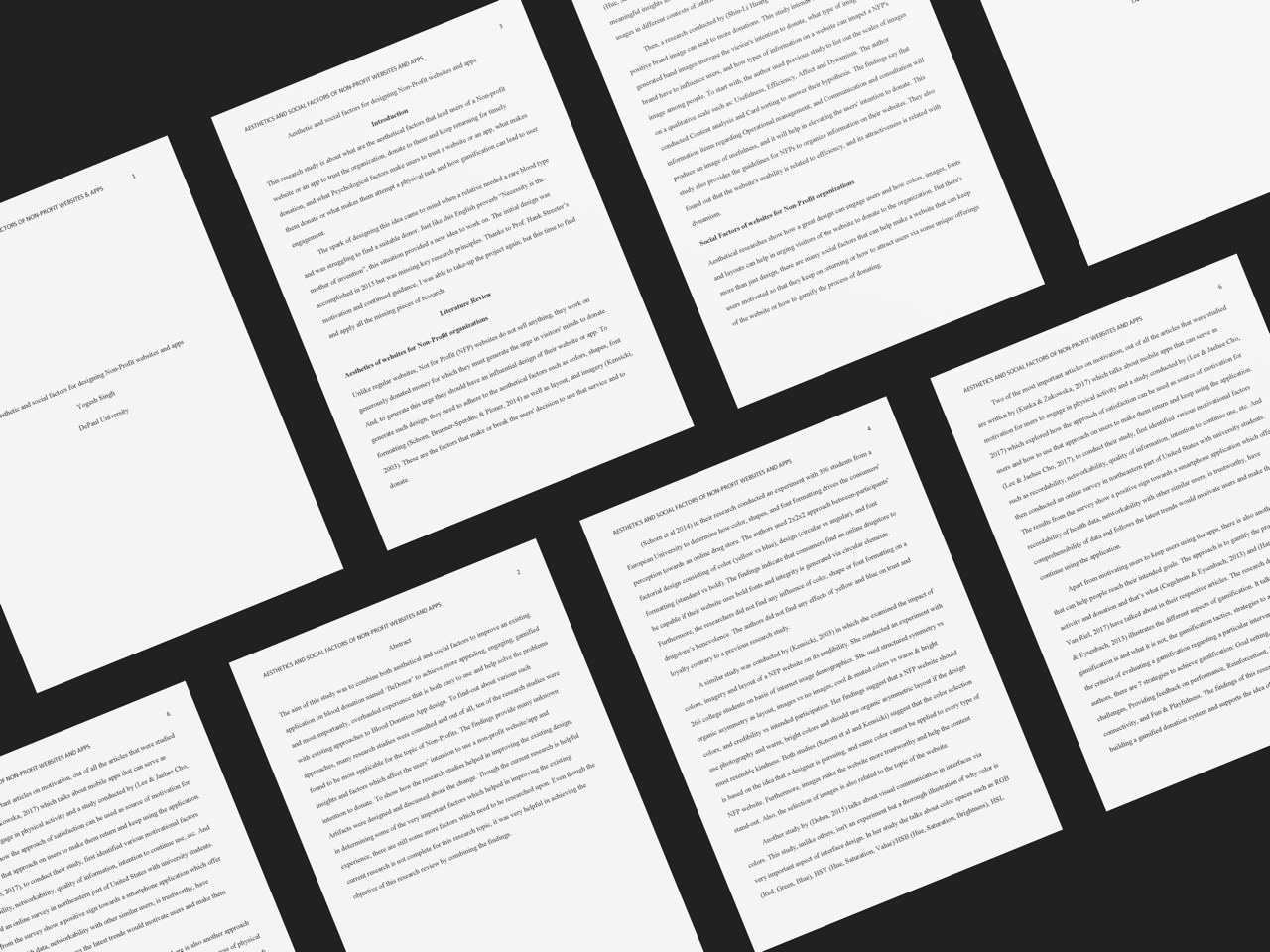
Mockup of Research Paper
Creating a New Identity
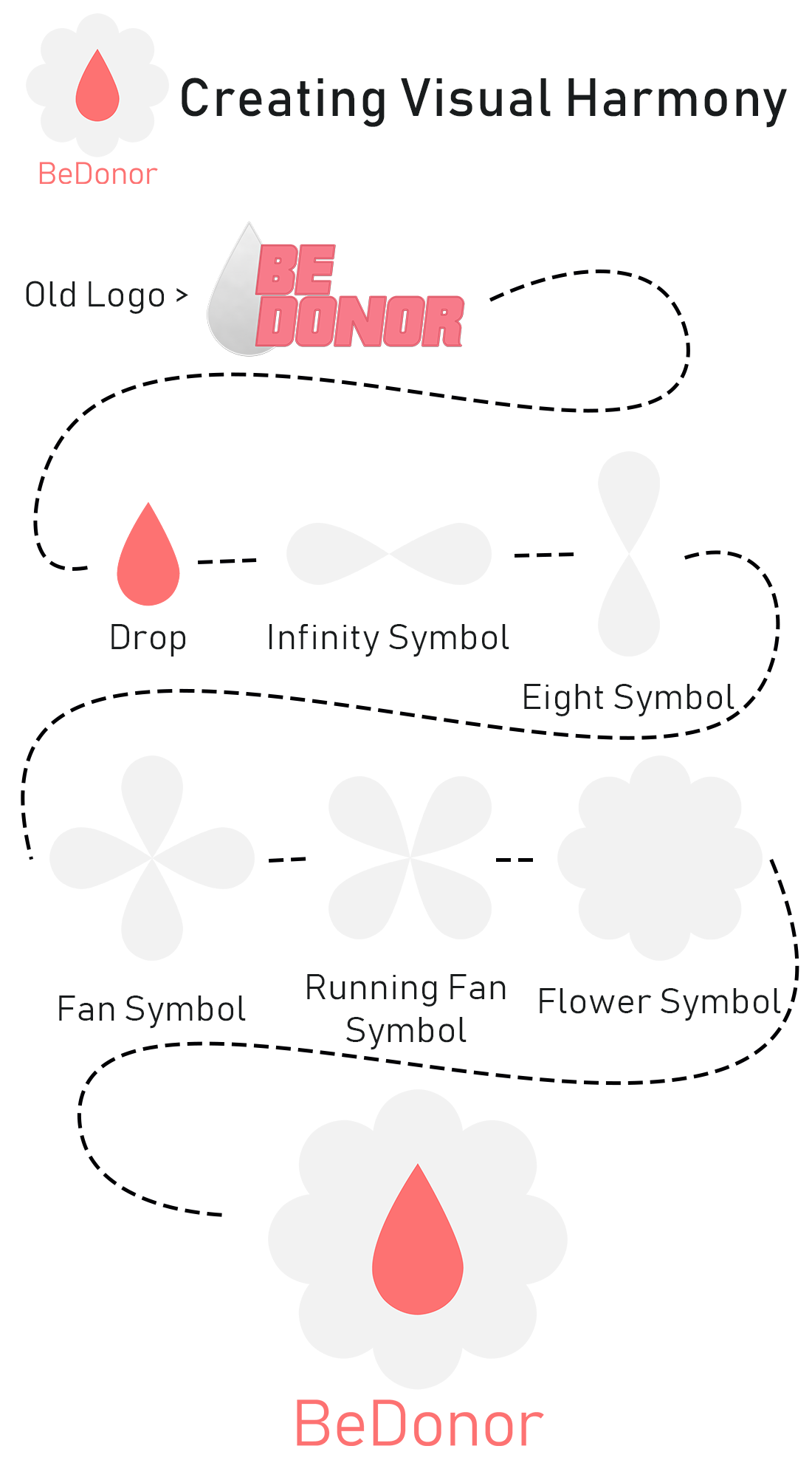
Journey of logo from bold-old design to tender-harmonious design
The drop assumes various forms, ranging from an infinity symbol to a flower symbol, symbolizing the delicate and sensitive nature of blood donation. This dynamic representation also serves to illustrate the transformative power and impact of blood donation.

Logo Style tile
Envisioning a Calmer User Interface
During my research review, I came across several key findings that influenced the creation of the new UI:
-
Bright and warm colors, along with circular elements, can promote visual harmony and create a soothing effect on users’ minds. When used effectively, these elements have the potential to enhance engagement on the website.
-
Users tend to connect more with real-life imagery compared to abstract or representative graphics.
-
Users prefer concise and relevant information, supplemented by visual cues such as icons and images.
-
Emojis can be utilized to provide feedback to users on their progress, creating a sense of achievement. They can also be leveraged to gamify the experience, making it more interactive and enjoyable.
-
Gamification elements, such as challenges, levels, and rewards, enhance the user experience and encourage continued interaction with the product.
-
By providing incentives, users are more likely to stay engaged with the product and continue using it.
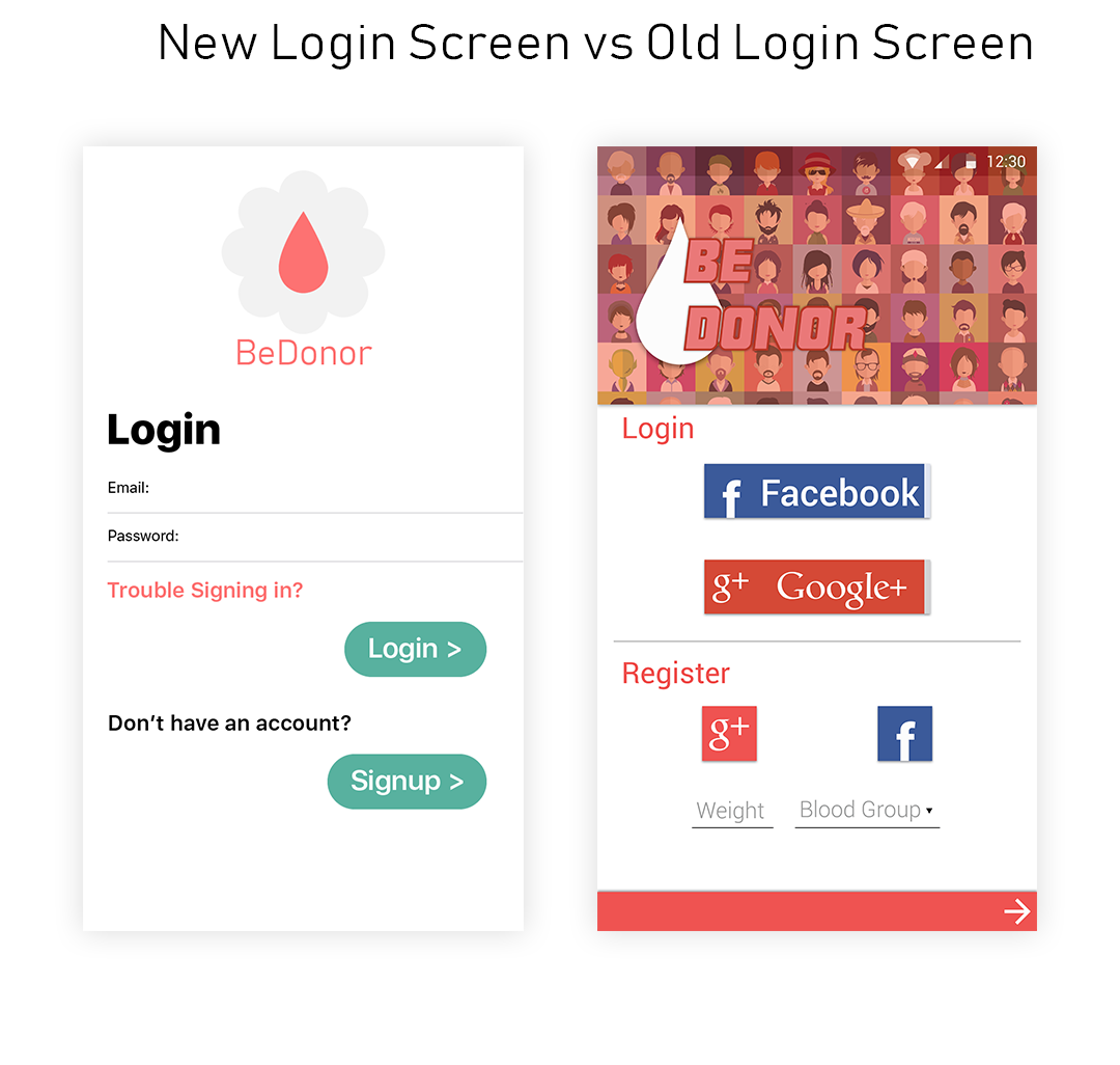
Trimmed-down minimalistic look that divides login, signup and forgot password into three separate sections.
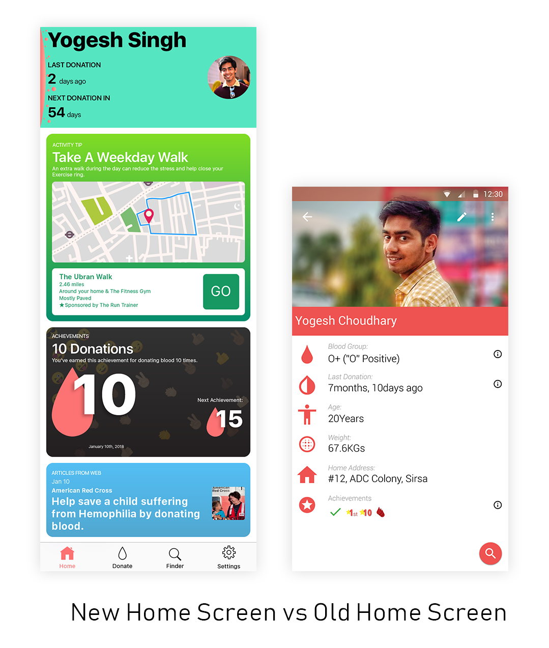
Providing information about user’s past and upcoming blood donation, suggestions, achievement and news about non-profits they care about.
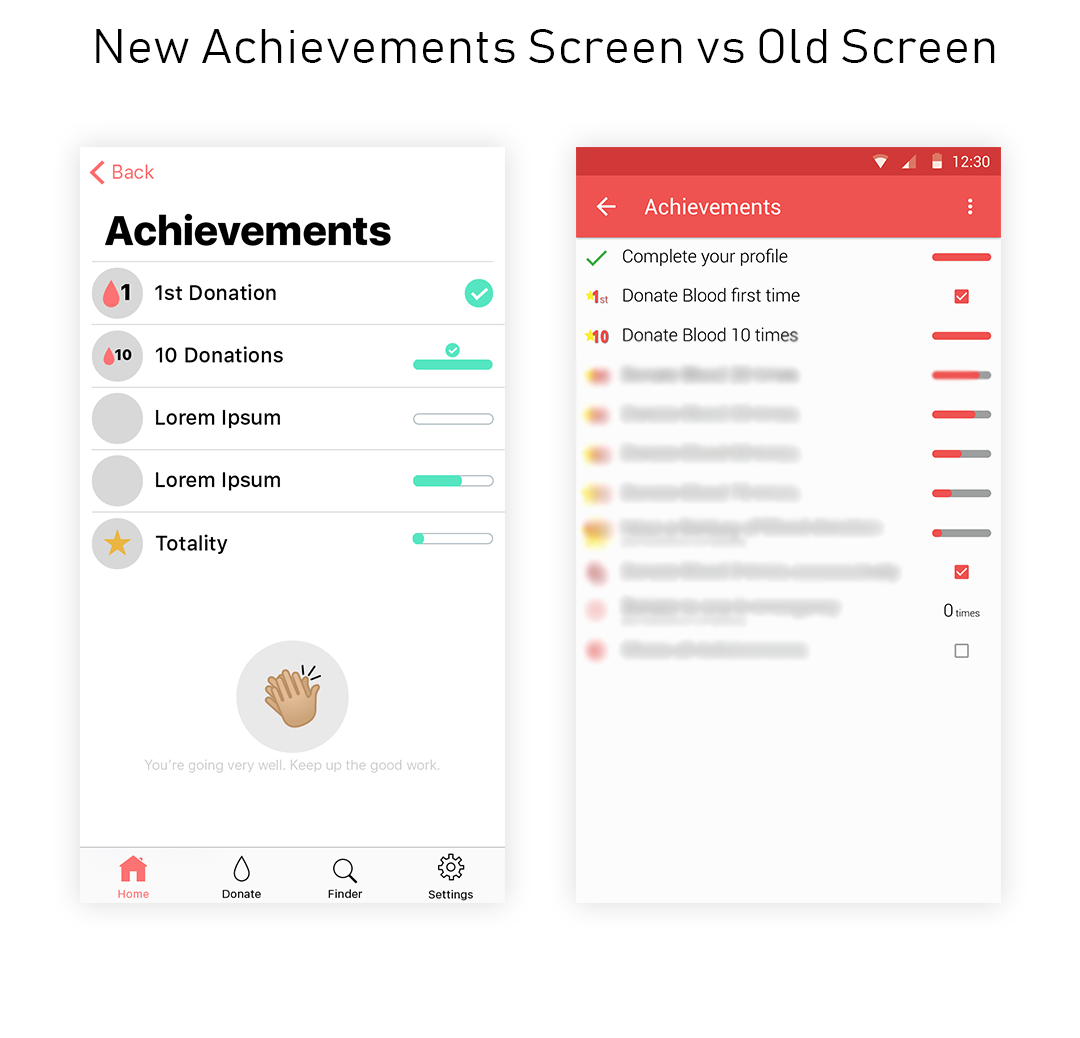
Utilizing emojis and easy to understand iconography and progress bars.
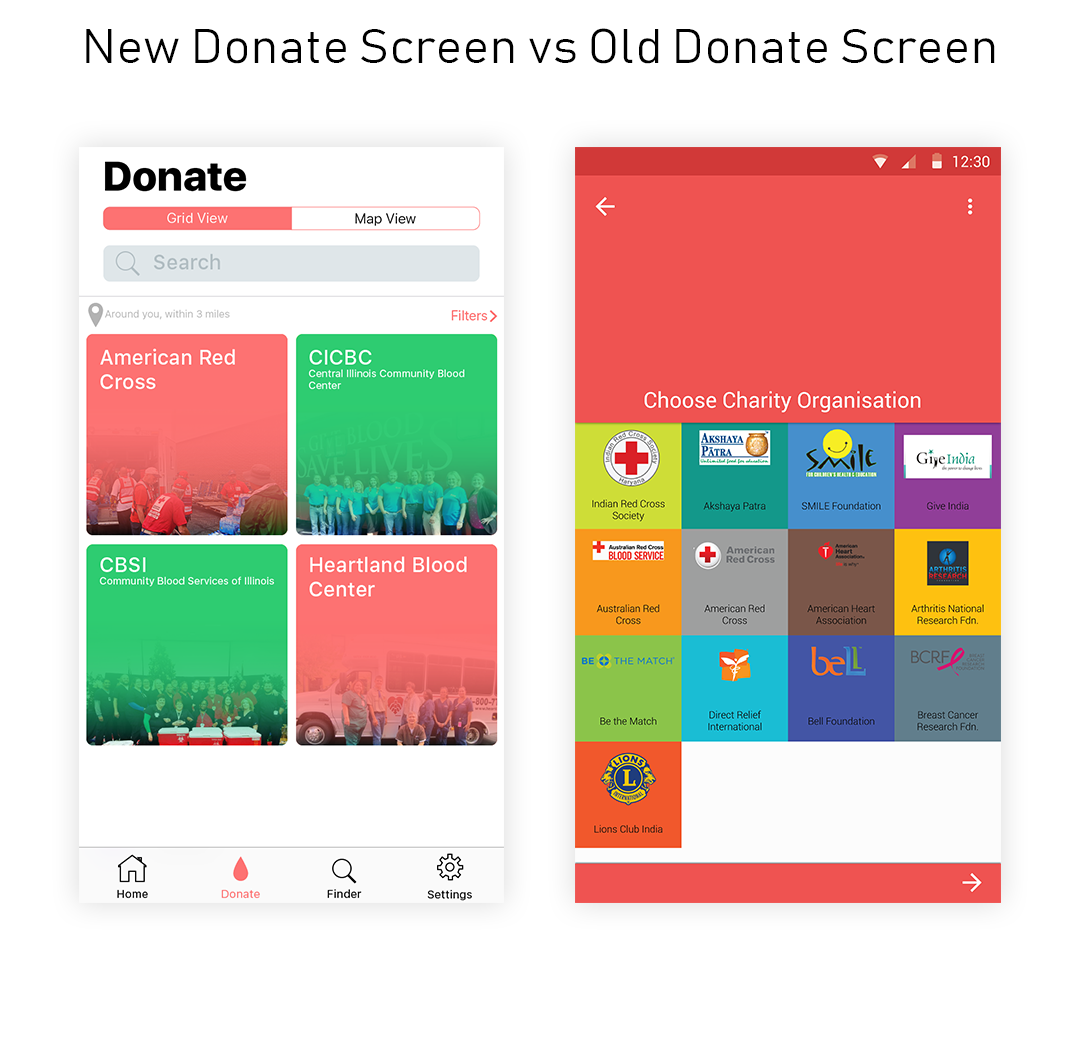
Images from non-profits to make the donation page more credible and compelling.
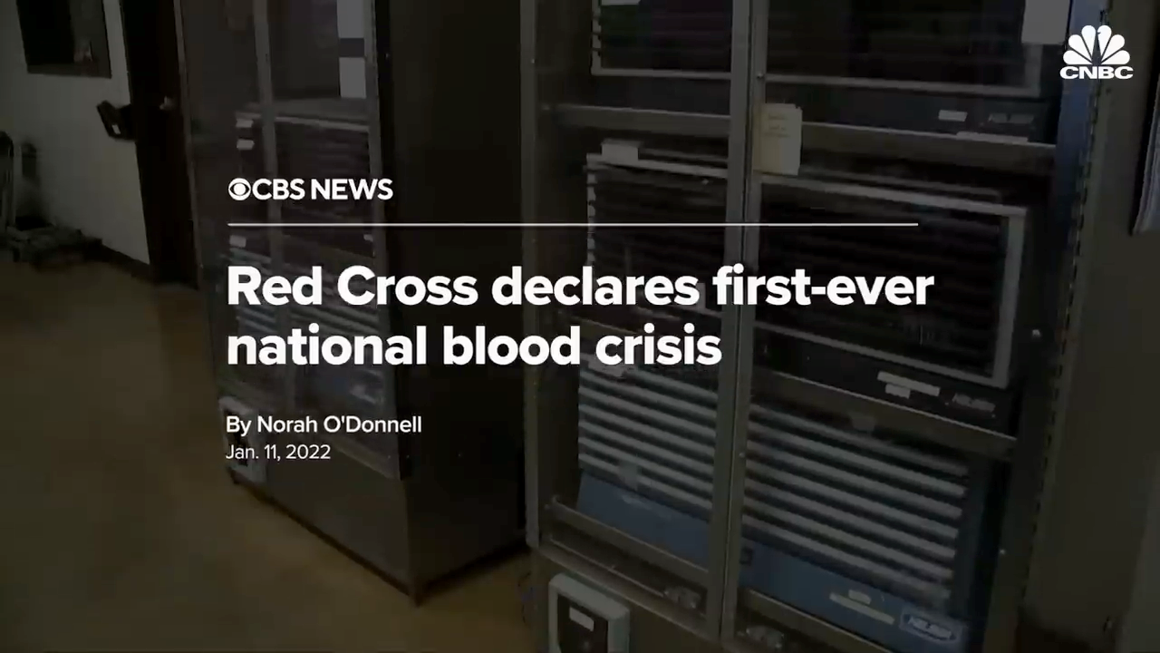
2022 - 2023: Giving Context to Research
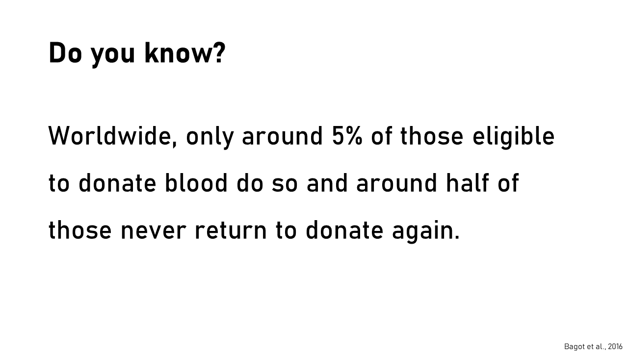
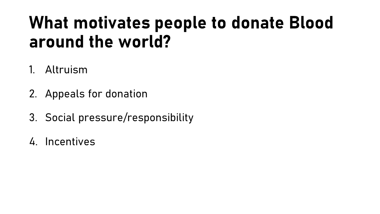
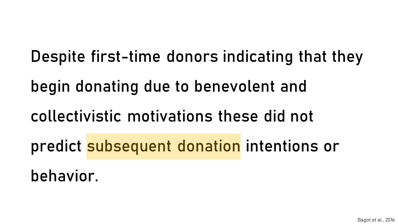
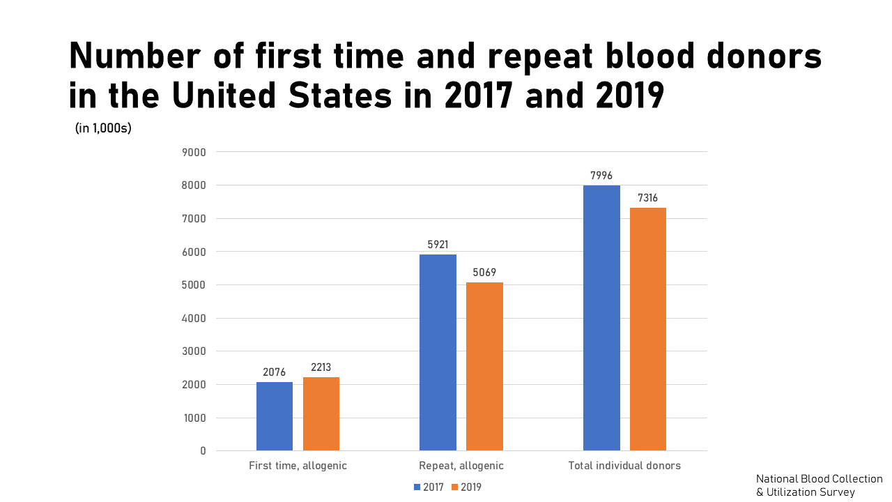
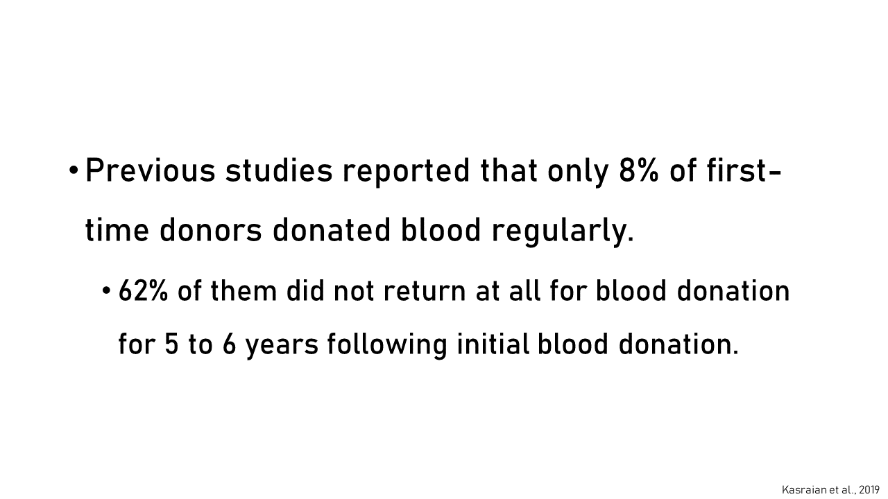
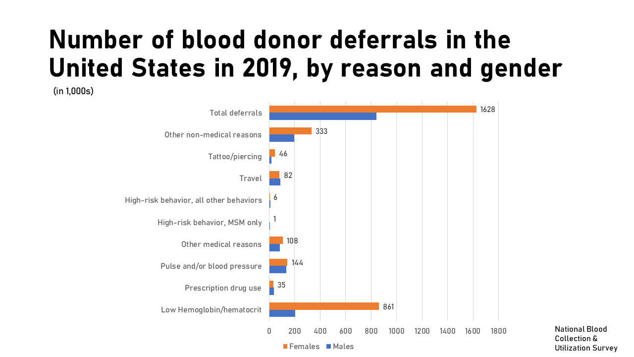
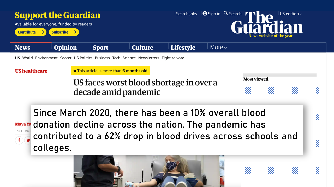
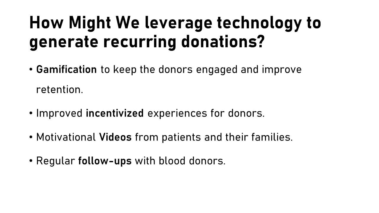
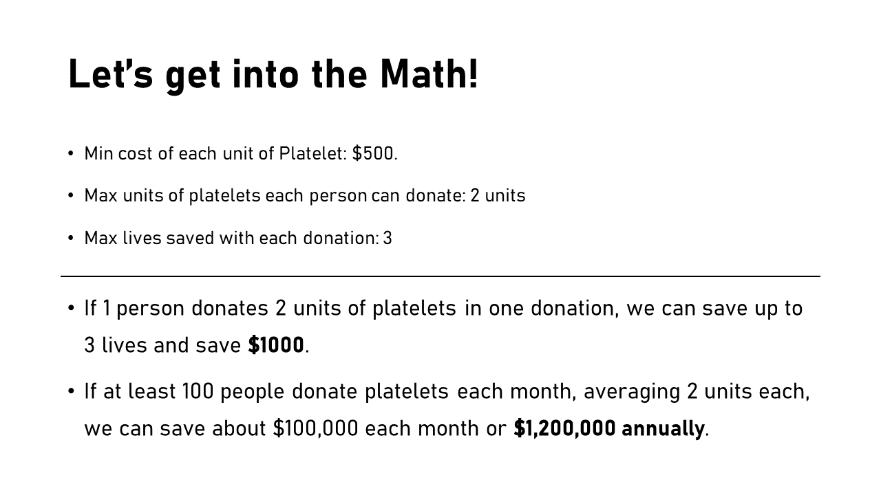
During my tenure as a UX Designer at St. Jude Children’s Research Hospital, I had the opportunity to delve deeper into the concept of blood donation with the aim of cutting costs and saving children’s lives. As a hospital that does not charge its patients and families, St. Jude relies heavily on the generosity of donors and the effective utilization of donor dollars. Additionally, St. Jude operates its own blood donation center, which often faces challenges in maintaining an adequate supply of blood, much like other blood banks worldwide. So, here’s some info from my research:
Design and Beyond
To demonstrate how a better Blood Donation User Experience can benefit users, I created a much more improved wireframe, taking inspiration form all my previous user interfaces, and utilizing research. The goals were:
-
Ease the process of setting up a donor profile.
-
Making the donation type selection more informative by providing the eligibility, frequency, and time.
-
Showcasing a better utulization of incentives, engagement, and rewards.
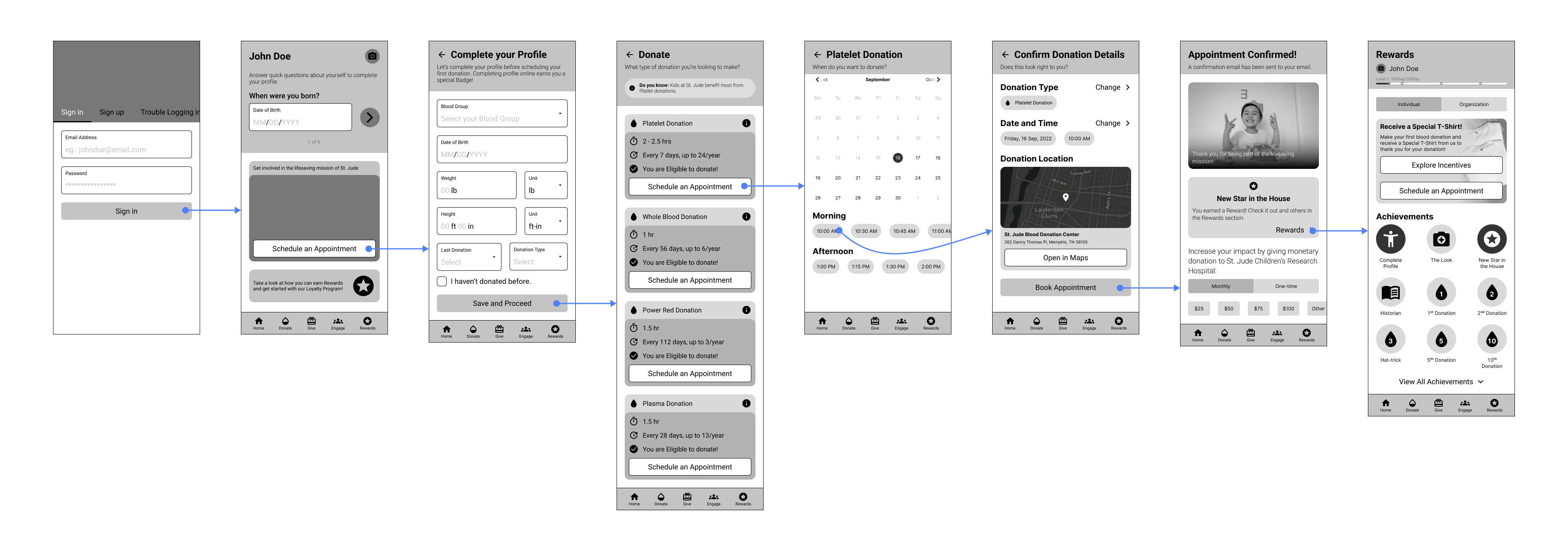
Version 3.0 Wireframe showing Donation process flow
A Pilot Program to Acquire New Donors
In June 2023, I collaborated with the Event Experiences team to set up a Pilot Program for the 2023 ALSAC Town Hall meeting. The goal was to set up a booth for St. Jude Blood Donor Center for the attendees to check out, and schedule their blood or platelet donations based on their eligibility and availability. The booth set up was quite successful with 32 people registering their interest to donate and 28 people actually making the donation.
Read Next:
ALS Assist Desktop OS Concept
How Might We solve the communication problems of people suffering from Motor Neuron Disease and make their everyday tasks more accessible?
View Project